
Why Pills Look the Way They Do—and Why It Changes How They Work

Before a medicine does anything in the body,
it does something in the mind.
You see it.
You register it.
You make a judgement.
White. Clean. Safe.
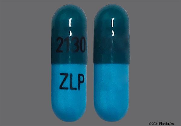
Blue. Calm. Sleep.
Red. Strong. Fast.
None of this is written on the label.
And yet, it shapes what happens next.
The design of a pill is not just visual.
It is psychological.
1. Medicine Is Interpreted Before It Is Absorbed
We think of drugs as chemical systems.
But they are also perceptual systems.
The moment a patient encounters a pill, they form expectations:
- How strong it is
- How fast it will work
- How safe it feels
These expectations influence:
- Willingness to take it
- Confidence in its effect
- Perceived outcome
This is not abstract.
It is measurable.
2. The Placebo Effect Is Not a Side Effect
The Placebo Effect is often misunderstood as illusion.
It isn’t.
It is a demonstration that:
Belief changes biology
Patients given identical inactive pills report different effects depending on:
- Colour
- Shape
- Branding
- Context
A red pill may feel stimulating.
A blue pill may feel calming.
Even when both contain nothing.
So when an active drug is introduced:
Chemistry and perception combine
3. Colour Is a Language
Pharmaceutical colour choices are not random.
They follow a quiet, consistent logic:
- White → purity, simplicity, safety
- Blue → calm, sleep, control
- Red / orange → strength, urgency, energy
Patients rarely articulate this.
But they feel it.
Colour influences:
- Trust
- Compliance
- Perceived potency
A pill doesn’t just deliver a drug.
It delivers a signal.
4. Shape Reinforces Meaning
Shape adds another layer:
- Round → neutral, standard, familiar
- Oval → easier, smoother, more “modern”
- Capsule → advanced, controlled, premium
These shapes affect:
- Perceived swallowability
- Confidence in technology
- Emotional response
Even when the chemical content is identical.
The geometry of a pill becomes part of its identity.
5. Branding Without Saying a Word
Pharmaceutical companies rarely advertise pills the way consumer brands do.
But design still communicates:
- Colour consistency across products
- Recognisable shapes
- Distinctive coatings
This creates:
Visual branding at the point of use
Patients may not remember the drug name.
But they remember:
- “The small white one”
- “The blue capsule”
- “The long oval tablet”
Design becomes memory.
6. Trust Is Engineered

Trust in medicine is not accidental.
It is constructed through:
- Clean design
- Consistent appearance
- Familiar formats
A pill that looks:
- Uniform
- Smooth
- Controlled
Feels safer.
Even before it is taken.
7. When Design Changes Outcomes
This is where it becomes profound.
Design doesn’t just influence perception.
It influences results.
Studies have shown:
- Different coloured pills → different reported effects
- Branded drugs → perceived as more effective than generics
- Larger pills → perceived as stronger
Even when chemically identical.
The experience of medicine is partly designed.
8. The Hidden Trade-Off
But there’s a tension.
Design is optimised for:
- Trust
- Recognition
- Compliance
Not always for:
- Function
- Absorption
- Personalisation
A pill may:
- Look reassuring
- Feel familiar
But still:
- Dissolve unpredictably
- Deliver variable exposure
- Fail certain patients
The surface is optimised.
The system underneath is not always.
9. The Ibumix Perspective
The aesthetics of medicine reveal something deeper:
We have invested heavily in how medicine feels—
but less in how it truly performs.
We have:
- Perfected coatings
- Refined colours
- Standardised appearance
Because these are visible.
But the real challenges:
- Absorption
- Variability
- Delivery
Remain less addressed.
10. A Different Future
Imagine medicine where:
- Trust comes from performance, not appearance
- Design reflects function, not familiarity
- Experience is aligned with biology
Where:
- What you feel
- Matches what your body receives
Final Line
The pill works in two places—
the mind, and the body.
We designed the first.
The second is still catching up.